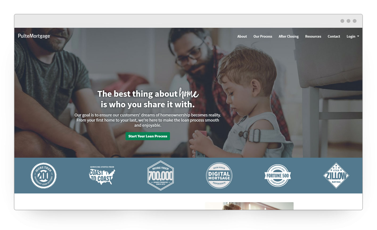
- Using the existing content, reorganize the information hierarchy
- Change the language used to be more friendly
- Redesign the look and feel to match the updated brand
- Create a new registration experience
- Ensure the updated site is ADA compliant (AA)
- Create confidence in the brand and experience
- Using Lucky Orange, I observed users on the existing site
- Leveraged a user survey after the user’s account was created
- User demographics and psychographics were solidified based on Builder customer profiles
Information Hierarchy
Because of the nature of the industry, the content that was in use was not easy to understand. I went through the existing content and translated it to have ore of a conversational tone. Then, began flowing in basic wireframes for premiere, secondary and tertiary layouts and presented them. Once I had executive sign off, I went through and flowed the updated content into their new layouts.
Design & Conversion
Being an Agile environment, all the pages were designed, created and deployed individually so they could be released on schedule. It has driven more traffic through the user registration process in half the time and our user survey ratings increased by 15%.

